Introducing MUI X v7
After a few months in pre-release, we're thrilled to announce the stable release of MUI X v7.0.0, packed with new components, exciting features, improved usability, and developer experience.
Table of contents
- Data Grid
- Tree View
- Charts
- Date and Time Pickers
- What's next
- Long-term support
- Migration guide
- How to get involved
Data Grid
Column resizing on the Community plan
As MUI X commercial offerings continue to expand, we're pleased to enhance the Community plan by integrating features previously exclusive to commercial users.
Column resizing and auto-sizing, which were previously Pro features, are now available to all the users at no cost. This transition reflects our commitment to providing an exceptional user experience across the board, and aims to make the free components stand out more in the open-source space.
Sticky headers and improved scrolling performance
The Data Grid now offers a more responsive experience with smoother scrolling and enhanced screen reader support, thanks to a refactor of the column headers and pinning implementations.
On its first announcement, some of these improvements were showcased, but during the beta phase, the scrolling performance was further polished for an even better user experience.
Improved columns panel design
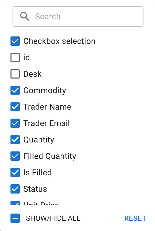
As part of an overarching project aimed at enhancing usability in managing columns within the Data Grid, we've redesigned the column visibility panel, introducing a more streamlined, checkbox-based interface to replace the previous toggle switch design.
The goal is to further enhance this panel by incorporating additional column management functions, such as column reordering and pinning. Additionally, the internal component has been extracted to ease the introduction of the upcoming pivoting UI.
Date Object support in filter model
The filterModel now supports Date objects for date and dateTime column types, providing a more intuitive and efficient filtering experience.
While string values remain compatible for these types, any updates to the filterModel made through the UI (such as via the filter panel) will automatically use Date objects, ensuring consistency and ease of data handling.
Smaller bundle size
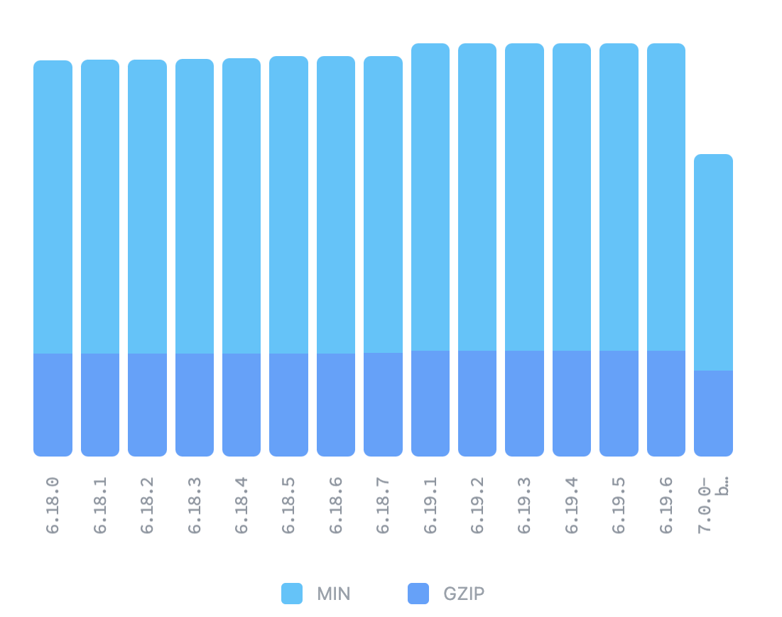
Introducing a separate entry point for locales has significantly reduced the bundle size of the barrel index when tree-shaking isn't operational (for example, webpack in dev mode).
As a reference, with the @mui/x-data-grid npm package, this change led to a reduction of approximately 19% – shrinking the bundle size from 114.2kB to 92.9kB.
New stable features
To ensure that new features can be introduced throughout the lifecycle of a major stable version without waiting for pre-releases, MUI X releases them marked as experimentalFeatures or with the unstable_ prefix.
We're excited to announce that the following features have been promoted to stable:
Tree View
Since the promotion from the lab's package to MUI X, the primary focus has been on improving the component's developer experience. This includes efforts aimed to simplify its usage, implement new customization APIs, and provide clearer documentation and illustrative examples, making them more informative and user-friendly.
A significant addition is the time-saving alternative to the traditional JSX architecture, the Rich Tree View.
Rich Tree View
The Tree View was split into two distinct components.
The first is the Simple Tree View, which retains the classic and familiar JSX approach and is still the one behind the original Tree View.
The second is the Rich Tree View, a new component designed to streamline the development process, and with which we aim to support several common use cases out-of-the-box.
Similar to the Data Grid, it only requires a dataset and possibly a few properties to render; it does all the heavy lifting for you, handling most of the complexities internally.
const myDataSet = [
  {
    id: 'node-1',
    label: 'Node 1',
    children: [
      { id: 'node-1-1', label: 'Node 1.1' },
      { id: 'node-1-2', label: 'Node 1.2' },
    ],
  },
  {
    id: 'node-2',
    label: 'Node 2',
  },
];
<RichTreeView items={myDataSet} multiSelect />
Check out the new component!
New customization hook: useTreeItem2
The Tree View now features a new API that enables fully customization of Tree items through a hook called useTreeItem2.
It can be used with both Simple Tree View and Rich Tree View, and empowers developers to fully leverage the Tree Item's subcomponents along with their default behaviors.
This approach ensures customization and flexibility are at the forefront without sacrificing the component's inherent features.
When using this hook, you can create a tailored Tree Item that aligns perfectly with your project needs while reusing key behaviors and features the component is known for.
const CustomTreeItem = React.forwardRef(function CustomTreeItem(
  props: TreeItem2Props,
  ref: React.Ref<HTMLLIElement>,
) {
  const { id, nodeId, label, disabled, children, ...other } = props;

  const {
    getRootProps,
    getContentProps,
    getIconContainerProps,
    getLabelProps,
    getGroupTransitionProps,
    status,
  } = useTreeItem2({ id, nodeId, children, label, disabled, rootRef: ref });

  // Compose and implement your tree item as you need
  return (
    <TreeItem2Provider nodeId={nodeId}>
      <TreeItem2Root {...getRootProps(other)}>
        <TreeItemContent {...getContentProps()}>
          <TreeItem2IconContainer {...getIconContainerProps()}>
            <TreeItem2Icon status={status} />
          </TreeItem2IconContainer>
          <Box sx={{ flexGrow: 1, display: 'flex', gap: 1 }}>
              {(label as string)[0]}
            </Avatar>
            <TreeItem2Label {...getLabelProps()} />
          </Box>
        </TreeItemContent>
        {children && <TreeItem2GroupTransition {...getGroupTransitionProps()} />}
      </TreeItem2Root>
    </TreeItem2Provider>
  );
});
<RichTreeView items={myDataSet} slots={{ item: CustomTreeItem }} />
You can check all the details of the given example on the Rich Tree View customization page.
Charts
Since launching MUI X Charts, we've been closely listening to your feedback, and our focus has been on refining these foundational elements through bug fixes, enriched documentation, and increasing support for more complex scenarios.
The charts portfolio has also expanded with one of the most commonly used data visualization components for dashboards.
Gauge charts
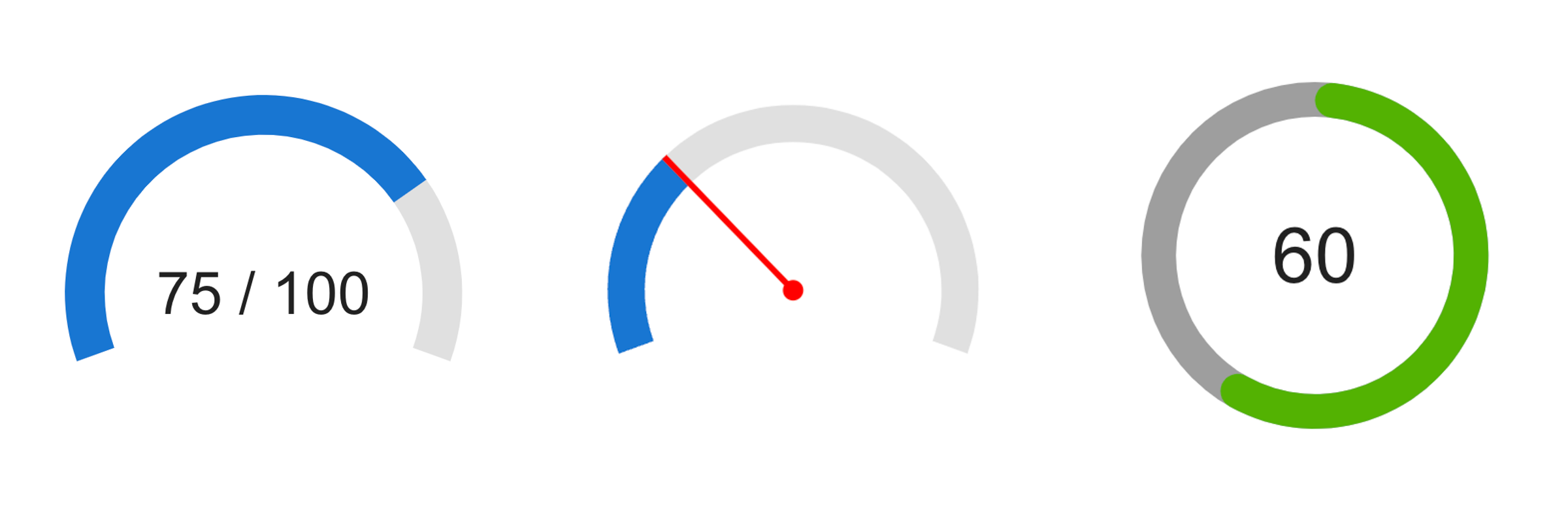
The newest gauge charts are designed to offer a visually compelling way to display data metrics within a circular gauge.
These charts are particularly useful for showing progress toward a goal or displaying a value within a predefined range. With customizable options for pointers, sizes, and colors, they allow for a personalized visual representation that makes it easy for users to interpret data at a glance.
Check out the new charts documentation page for detailed information.
Click event handler
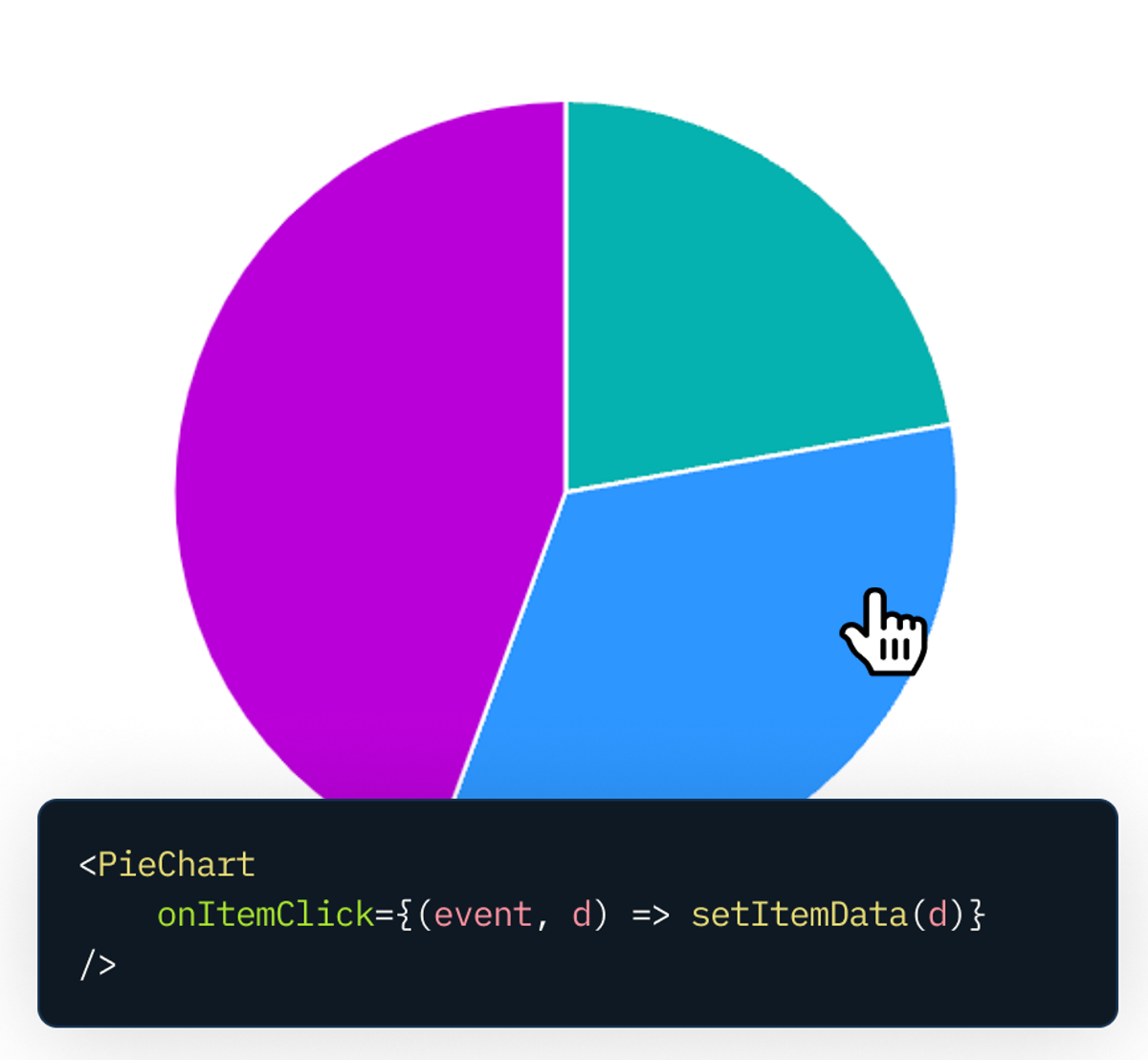
The charts now have click event handlers, so users can interact with chart elements and trigger advanced actions, such as opening a custom modal with detailed information.
This feature makes charts more interactive and transforms the way users can explore the data, improving the overall user experience with details and other information accessed on demand.
You can find more information about specific event handlers for each type of chart by visiting their respective overview page:
Built-in Grid
The Axis component now features a built-in Grid, offering users a structured layout for easier data analysis and visualization.
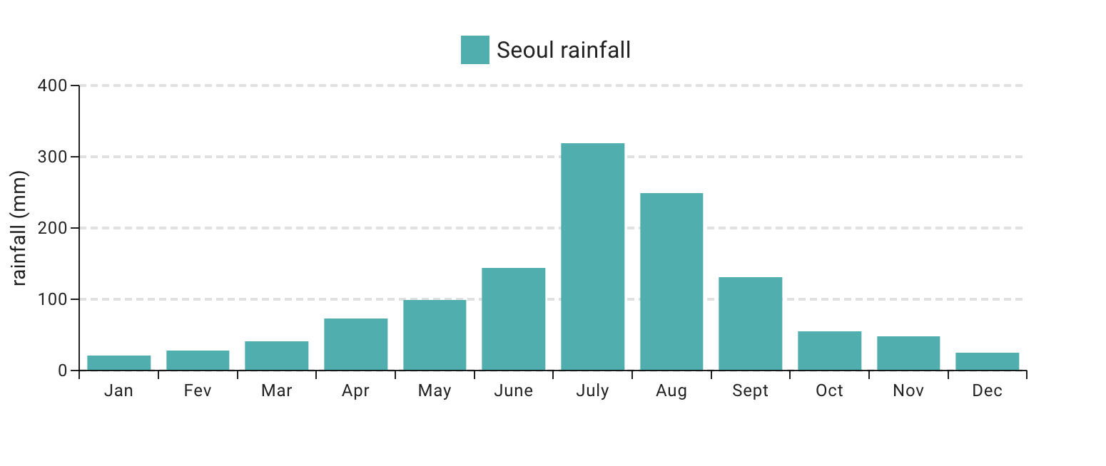
For details on its usage and configuration, please refer to the Grid section in the documentation.
Reference line
The ChartsReferenceLine component enhances data visualization, providing users with a clear reference to better understand and analyze key data points.
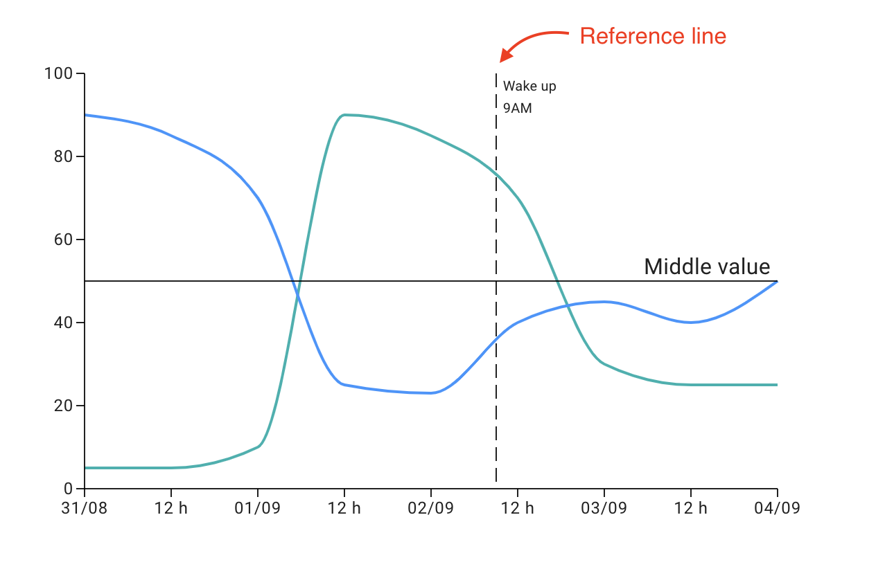
You can find more details on its documentation.
Date and Time Pickers
The focus has been primarily on developing the highly anticipated Date Time Range Picker, alongside a significant effort to enhance accessibility in the fields, ensuring that our components are as inclusive and user-friendly as possible.
Improved accessibility for the field components
You can now set the enableAccessibleFieldDOMStructure prop to enhance the DOM structure of fields and pickers components.
This improvement addresses accessibility limitations of the traditional <input /> element by enabling a new DOM structure that effectively manages ARIA attributes within multiple input sections.
This feature greatly improves the experience for screen reader users, making interactions with fields and pickers more intuitive and accessible.
<DateField enableAccessibleFieldDOMStructure />
<DatePicker enableAccessibleFieldDOMStructure />
For more details, please check out the documentation section.
Support for date-fns v3
The Date and Time Pickers now support both versions of v2 and v3 of date-fns, and you can select your desired version from one of the two import lines:
// date-fns v2.x
import { AdapterDateFns } from '@mui/x-date-pickers/AdapterDateFns';

// date-fns v3.x
import { AdapterDateFns } from '@mui/x-date-pickers/AdapterDateFnsV3';
Date Time Range Picker
The latest addition to the Date and Time Pickers suite is the <DateTimeRangePicker />, a most anticipated component designed to enrich the user experience with the advanced date and time selection.
This intuitive picker simplifies the process of selecting date and time ranges, making it ideal for applications that require detailed scheduling or period selection.
Learn how to use and customize the new component now!
What's next
As usual, we're committed to further improving the library by introducing new features, refining existing ones, and focusing on community feedback to shape our roadmap.
Throughout this year, we'll invest in making MUI X components design agnostic. The components will still ship using Material UI as the default, but we're striving to ensure that they seamlessly integrate with any design system. The result is advanced components offering extreme flexibility and customization options, enabling a broader range of application styles without compromising the high-quality use cases and workflows that MUI X is known for.
We're also excited to announce that we're transitioning MUI X components from using Emotion to using Pigment CSS, MUI's new zero-runtime CSS-in-JS library. This move is aimed at better supporting React Server Components, boosting performance and guaranteeing compatibility with the next major version of Material UI.
Additionally, the following are the deliveries planned for the next few months.
Data Grid
- Improved server-side integration
- Column management panel with support for pivoting and other features
- Pivoting
Tree View
- Inline node name editing
- Checkbox selection for Simple Tree View and Rich Tree View
- Drag and drop support for Rich Tree View
Charts
- Improved label flexibility and customization
- Zoom and navigation
- Heatmap
Date and Time Pickers
For a complete overview, please visit the MUI X roadmap.
Long-Term Support
We roll bug fixes, performance enhancements, and other improvements into new releases, so as we introduce MUI X v7, MUI X v6 now is officially in Long-Term Support (LTS). This means only critical bug fixes and security updates will be patched to MUI X v6.
Support for MUI X v5 is officially discontinued, and we encourage you to migrate to v6 and then to v7 to benefit from enhanced features, performance improvements, and ongoing support.
Migration guide
Updating a dependency library can sometimes be daunting. To smooth the transition to the new version, we have documented all breaking changes in our migration guides:
These component-specific guides are reference pages designed to assist you if you encounter any challenges while updating to the new major version. It's our way of making the upgrade process more manageable and less burdensome for you. However, should you need further assistance, please don't hesitate to contact us and send your feedback.
How to get involved
Your feedback played a crucial role in shaping MUI X, and we always appreciate hearing from you. To continue enhancing our product, we invite you to share your pain points and challenges with us by:
- Giving us a user interview.
- Reporting bugs and suggesting features on our GitHub repository.
We look forward to your input!
