Upgrade to v6
This guide explains why and how to upgrade from Material UI v5 to v6.
Why you should upgrade to Material UI v6
React Server Component support
Material UI v6 introduces Pigment CSS, a zero-runtime CSS-in-JS styling engine to replace Emotion and styled-components as a more future-proof solution for writing styles in React 19 and beyond. With Pigment CSS, styles are extracted at build time rather than runtime, avoiding client-side recalculations and unlocking React Server Component (RSC) compatibility. This also leads to significant reductions in bundle sizes for Material UI apps.
In v6, Pigment CSS is opt-in. Future major versions of Material UI will likely use Pigment CSS as the default styling solution. Though optional, it's encouraged to try Pigment CSS out in your Material UI app. If you wish to do so, refer to the guide for migrating to Pigment CSS once you're done upgrading to Material UI v6.
Quality-of-life improvements
Material UI v6 features several other quality-of-life improvements, including:
ThemeProvidernow supports all of theCssVarsProviderfeatures- support for container queries
- a new theme utility for adding styles to specific color modes
If you're using any of these packages, you can also change their version to "6.0.0":
@mui/icons-material@mui/system@mui/lab@mui/material-nextjs@mui/styled-engine-sc@mui/utils
Note that MUI X packages do not follow the same versioning strategy as Material UI. If you're using any of the following packages, they should remain unchanged during the upgrade process:
@mui/x-data-grid@mui/x-data-grid-pro@mui/x-data-grid-premium@mui/x-date-pickers@mui/x-date-pickers-pro@mui/x-charts@mui/x-tree-view@mui/x-tree-view-pro
Supported browsers and versions
The default bundle targets have changed in v6.
The exact versions will be pinned on release from the browserslist query: "> 0.5%, last 2 versions, Firefox ESR, not dead, safari >= 15.4, iOS >= 15.4".
- Node.js 14 (up from 12)
- Chrome 109 (up from 90)
- Edge 121 (up from 91)
- Firefox 115 (up from 78)
- Safari 15.4 in both macOS and iOS (up from 14 in macOS and 12.5 in iOS)
- and more (see .browserslistrc
stableentry)
Removed support for IE 11
Support for IE 11-the legacy bundle and all IE 11-related code-has been completely removed in v6. This decreases Material UI's bundle size and eases future development.
If you need to support IE 11, you can use v5's legacy bundle. Note that it will not receive updates or bug fixes in the future.
Minimum React version
The minimum supported version of React is v17.0.0 (the same as v5).
Use the snippet below to update your project (replace the <version> with the one you want):
npm install react@<version> react-dom@<version>Minimum TypeScript version
The minimum supported version of TypeScript has been increased from v3.5 to 4.7.
If your project includes these packages, you'll need to update them:
@types/react@types/react-dom
Breaking changes
Material UI v6 was designed to introduce minimal breaking changes when upgrading from v5. These include browser support updates, a Node.js version bump, and the removal of the UMD bundle. These updates reduce the Material UI package size by 2.5MB—nearly 25% of the total size in v5.
Codemods are provided to handle the majority of these breaking changes.
UMD bundle removed
To align with React 19's removal of UMD builds, Material UI has also removed its UMD bundle.
This results in a reduction of the @mui/material package size by 2.5MB, or 25% of the total package size.
See Package Phobia for more details.
Instead, we recommend using ESM-based CDNs such as esm.sh. For alternative installation methods, refer to the CDN documentation.
Accordion
To meet the W3C Accordion Pattern standard, the Accordion Summary is now wrapped with a default <h3> heading element.
This change may affect customizations relying on the previous DOM structure and CSS specificity.
Additionally, the default heading element might conflict with existing heading structures on your page.
If your styles or DOM manipulations depend on the old structure, you will need to update them to accommodate the new heading element.
If the default heading element conflicts with your existing structure, you can change the heading element using the slotProps.heading.component prop.
<Accordion slotProps={{ heading: { component: 'h4' } }}>
  <AccordionSummary
    expandIcon={<ExpandMoreIcon />}
    aria-controls="panel1-content"
    id="panel1-header"
  >
    Accordion
  </AccordionSummary>
  <AccordionDetails>
    Lorem ipsum dolor sit amet, consectetur adipiscing elit. Suspendisse malesuada
    lacus ex, sit amet blandit leo lobortis eget.
  </AccordionDetails>
</Accordion>
Autocomplete
Three new values have been introduced to the reason argument in the onInputChange callback of the Autocomplete component.
These values offer more granular options for three specific use cases previously covered by "reset":
"blur": similar to"reset"but triggered when the focus moves away from the input.clearOnBlurmust betrue."selectOption": triggered when the input value changes after an option is selected."removeOption": triggered in multiple selection mode when a chip is removed as a result of its corresponding option being selected.
These are available in addition to the existing "input", "reset", and "clear" values.
Chip
In earlier versions, the Chip component would lose focus when the user pressed the esc key, which differs from how other button-like components work. In v6, the Chip now retains focus as expected.
To preserve the previous behavior, add a custom onKeyUp handler as shown below:
import * as React from 'react';
import Chip from '@mui/material/Chip';

export default function ChipExample() {
  const chipRef = React.useRef(null);
  const keyUpHandler = (event) => {
    if (event.key === 'Escape' && chipRef.current) {
      chipRef.current.blur();
    }
  };
  return (
    <Chip
      label="Chip Outlined"
      variant="outlined"
      ref={chipRef}
      onKeyUp={keyUpHandler}
    />
  );
}
Divider
When using vertical orientation, the Divider now renders a <div> with the corresponding accessibility attributes instead of <hr> to adhere to the WAI-ARIA spec. You might need to adjust your styles accordingly if you are targeting hr tags in your CSS.
-import Divider from '@mui/material/Divider';
+import Divider, { dividerClasses } from '@mui/material/Divider';

 const Main = styled.main({
-  '& hr': {
+  [`& .${dividerClasses.root}`]: {
     marginTop: '16px',
   },
 });
Grid2
The Grid2 (previously Unstable_Grid2) was updated and stabilized:
- The previous size (
xs,sm,md, ...) and offset (xsOffset,smOffset,mdOffset, ...) props, which were named after the theme's breakpoints, were replaced with thesizeandoffsetprops. - The spacing mechanism was reworked to use the
gapCSS property.
This brings some breaking changes described in the following sections.
Unstable prefix removed
The Grid2 component API was stabilized, so its import no longer contains the Unstable_ prefix:
-import { Unstable_Grid2 as Grid2 } from '@mui/material';
+import { Grid2 } from '@mui/material';
-import Grid from '@mui/material/Unstable_Grid2';
+import Grid from '@mui/material/Grid2';
Size and offset props renamed
In v5, the size and offset props were named to correspond with the theme's breakpoints. For the default theme, these were:
- Size:
xs,sm,md,lg,xl - Offset:
xsOffset,smOffset,mdOffset,lgOffset,xlOffset
In v6, these props are renamed to size and offset:
 <Grid
-  xs={12}
-  sm={6}
-  xsOffset={2}
-  smOffset={3}
+  size={{ xs: 12, sm: 6 }}
+  offset={{ xs: 2, sm: 3 }}
 >
If the size or offset is the same for all breakpoints, then you can use a single value:
-<Grid xs={6} xsOffset={2}>
+<Grid size={6} offset={2}>
Additionally, the true value for the size prop was renamed to "grow":
-<Grid xs>
+<Grid size="grow">
Use this codemod to migrate your project to the new size and offset props:
npx @mui/codemod@latest v6.0.0/grid-v2-props <path/to/folder>
Using custom breakpoints
The usage described above also applies to custom breakpoints:
-<Grid mobile={12} mobileOffset={2} desktop={6} desktopOffset={4}>
+<Grid size={{ mobile: 12, desktop: 6 }} offset={{ mobile: 2, desktop: 4 }}>
You can use the same codemod for custom breakpoints by providing the breakpoints as an argument:
npx @mui/codemod@latest v6.0.0/grid-v2-props <path/to/folder> --jscodeshift='--muiBreakpoints=mobile,desktop'
disableEqualOverflow prop removed
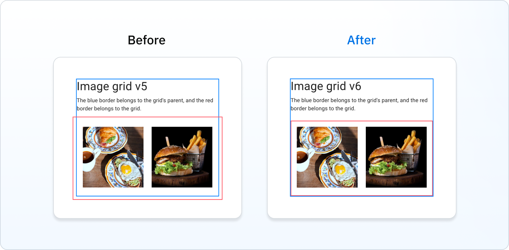
In v5, the Grid overflowed its parent. In v6, the Grid is correctly contained within its parent's padding:

This eliminates the need for the disableEqualOverflow prop:
-<Grid disableEqualOverflow>
+<Grid>
Grid item spacing change
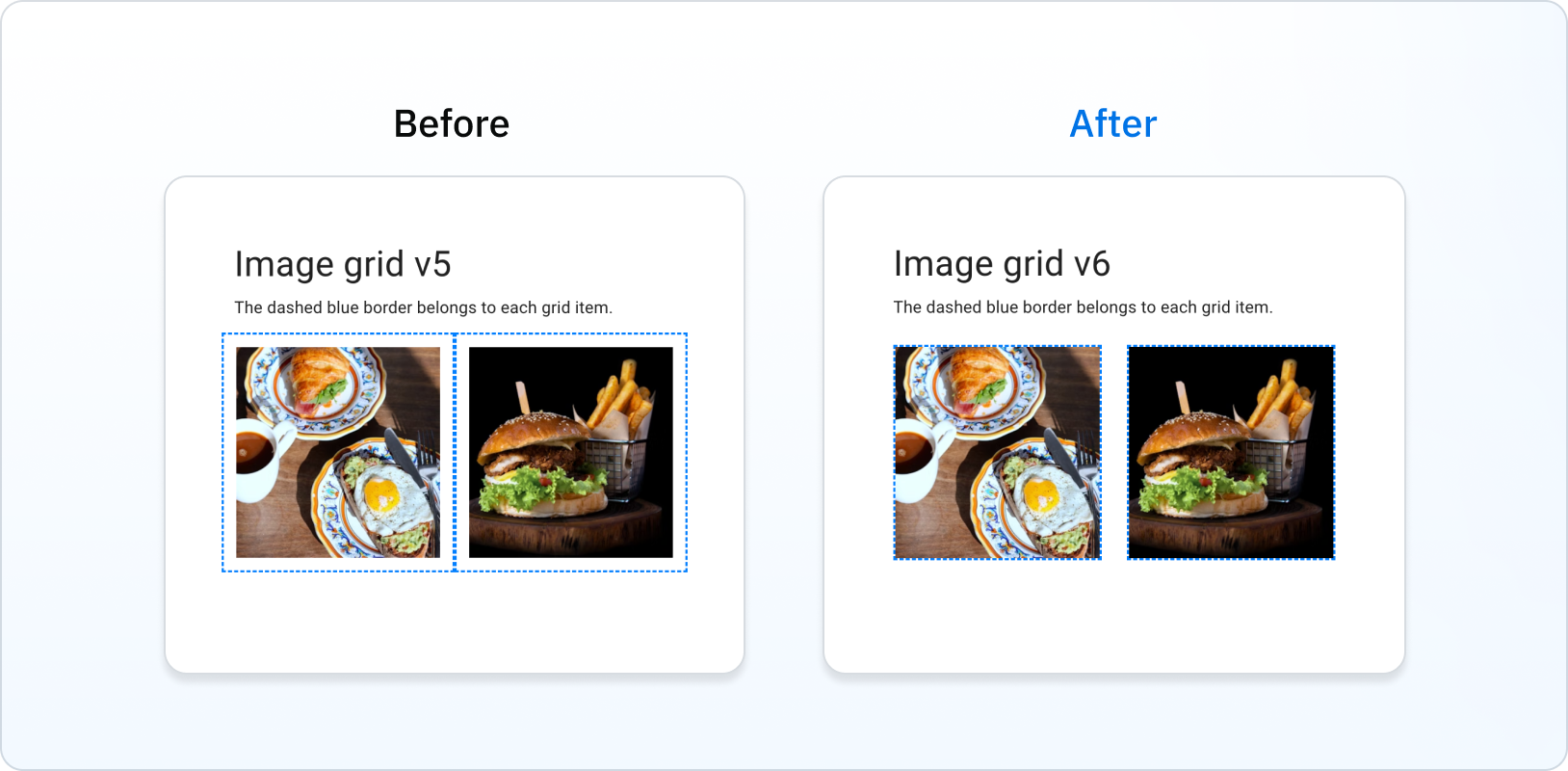
In v5, Grid items included spacing in their boxes. In v6, Grid items no longer include spacing in their boxes by using the CSS gap property.
Note that the item position doesn't change.

ListItem
ListItem's props autoFocus, button, disabled, and selected, deprecated in v5, have been removed. To replace the button prop, use ListItemButton instead. The other removed props are available in the ListItemButton component as well.
-<ListItem button />
+<ListItemButton />
Use this codemod to migrate your project to the ListItemButton component:
npx @mui/codemod@latest v6.0.0/list-item-button-prop <path/to/folder>
As the ListItem no longer supports these props, the class names related to these props were removed. You should use the listItemButtonClasses object instead.
-import { listItemClasses } from '@mui/material/ListItem';
+import { listItemButtonClasses } from '@mui/material/ListItemButton';

-listItemClasses.button
+listItemButtonClasses.root

-listItemClasses.focusVisible
+listItemButtonClasses.focusVisible

-listItemClasses.disabled
+listItemButtonClasses.disabled

-listItemClasses.selected
+listItemButtonClasses.selected
Loading Button
In v6, the children prop passed to the Loading Button component is now wrapped in a <span> tag to avoid issues when using tools to translate websites.
Typography
The color prop in the Typography component is not a system prop anymore. You can use the sx prop instead:
-<Typography color={(theme) => theme.palette.primary.main}>
+<Typography sx={{ color: (theme) => theme.palette.primary.main }}>
You still can access some theme colors directly using the color prop. Check the Typography component API page for the whole list of colors.
<Typography color="textSecondary">Secondary text</Typography>
useMediaQuery types
The following deprecated types are removed in v6:
MuiMediaQueryList: useMediaQueryList(from lib.dom.d.ts) instead.MuiMediaQueryListEvent: useMediaQueryListEvent(from lib.dom.d.ts) instead.MuiMediaQueryListListener: use(event: MediaQueryListEvent) => voidinstead.
Breaking changes affecting testing
Ripple effect
The ripple effect's performance has been improved in v6.
Because of this, you might need to update tests involving components with the ripple effect.
If you are using fireEvent from @testing-library/react to simulate user interactions, you will need to wrap these inside act and await to avoid React warnings:
- fireEvent.click(button);
+ await act(async () => fireEvent.mouseDown(button));
The components affected by this change are:
- All buttons
- Checkbox
- Chip
- Radio Group
- Switch
- Tabs
Breaking changes affecting types
Box
The component prop has been removed from the BoxOwnProps as it is already included in the Box type.
This might affect your code if you are using the styled function with the Box component.
If this is the case, use a div element instead of Box:
-const StyledBox = styled(Box)`
+const StyledDiv = styled('div')`
   color: white;
 `;
This yields the same end result.
If this doesn't work for you, you can also cast the styled returned value to typeof Box:
 const StyledBox = styled(Box)`
   color: white;
-`;
+` as typeof Box;
Stabilized APIs
CssVarsProvider and extendTheme
The CssVarsProvider and extendTheme APIs are now stable.
If you're already using them in v5 you can now drop the experimental prefix:
-import { experimental_extendTheme as extendTheme, Experimental_CssVarsProvider as CssVarsProvider } from '@mui/material/styles';
+import { extendTheme, CssVarsProvider } from '@mui/material/styles';
See CSS theme variables for more details about working with these APIs.
Color mode theme utility
Material UI v6 introduces a new utility for adding styles to specific color modes called theme.applyStyles(), designed to replace theme.palette.mode when applying light or dark styles:
 const MyComponent = styled('button')(({ theme }) => ({
   padding: '0.5rem 1rem',
   border: '1px solid,
-  borderColor: theme.palette.mode === 'dark' ? '#fff' : '#000',
+  borderColor: '#000',
+  ...theme.applyStyles('dark', {
+    borderColor: '#fff',
+  })
 }))
Use these codemods to migrate your project to theme.applyStyles():
npx @mui/codemod@latest v6.0.0/styled <path/to/folder-or-file>
npx @mui/codemod@latest v6.0.0/sx-prop <path/to/folder-or-file>
npx @mui/codemod@latest v6.0.0/theme-v6 <path/to/theme-file>
Deprecations
It is not required to immediately go through the deprecations in order to use Material UI v6.
You can do it at your own pace by checking out the deprecations page. Those deprecations will be removed in the next major version.
Pigment CSS integration (optional)
Once you've finished upgrading your app to v6, you'll be ready to start migrating to Pigment CSS for RSC support and a smaller bundle size.